
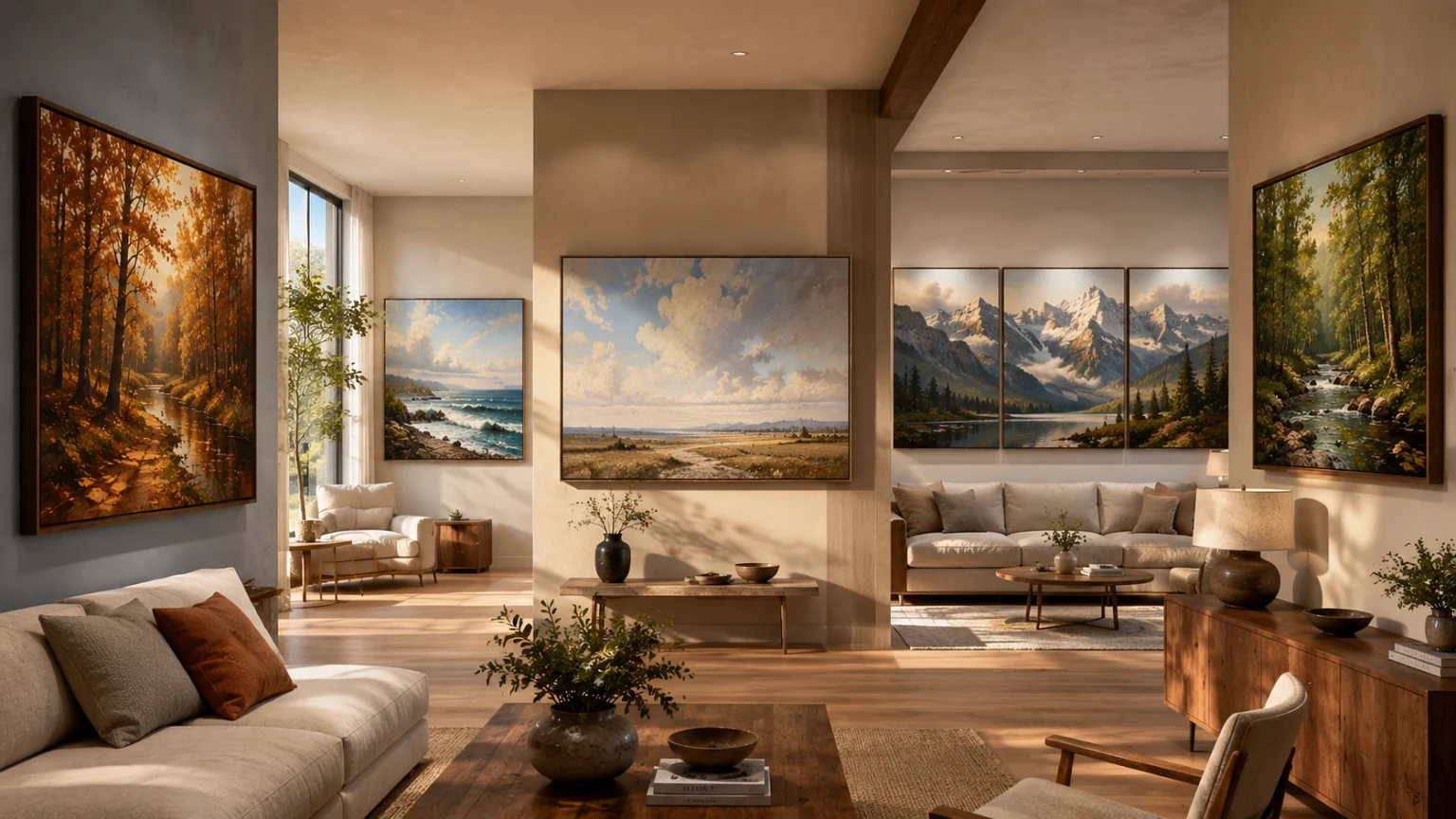
I have been painting landscapes for about two years now, still very much learning. But one thing I understood early, not from painting actually, but from hanging my own work at home. A painting that looks beautiful in the shop or in my studio can look completely dull on the wall. First I thought my painting was the problem. Later I realized the room’s light was the problem.
Most of us buy wall art by matching it with the sofa or curtain colors. The painting comes home, we hang it, and something feels wrong. The blue looks greyish. The sunset looks muddy. We blame the painting.Actually the light in the room decides how a painting will look. Every room gets a different type of natural light depending on which direction the windows face, and that light has its own color temperature. Big paint companies know this very well. Even tells customers to choose wall paint based on room direction, not only on decor. Same rule applies to paintings also, but nobody shops like this.
So here are five landscape painting ideas, arranged by the light condition of the room, not by color scheme.
First Understand What Light Direction Does
Sunlight is not one single color. It changes through the day and it changes by direction. A north-facing room gets soft but cool light with a slight blue-grey shade. A south-facing room gets warm golden light for most of the day. East and west rooms keep shifting between these two moods.
Now think of a landscape painting as one large block of color sitting inside that light. If you hang a cool snowy mountain scene in a north room, the cool light makes it even more cold and lifeless. If you hang a hot orange desert scene in a bright south room, the wall feels too heated by afternoon.
1. North-Facing Rooms Need Warm Landscapes
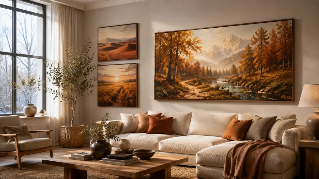
North rooms are famous for being difficult. The light is flat and cool. Farrow & Ball mentions in their guidance that northern light brings out the cooler tones in any color, so they advise avoiding blue or grey based shades in such rooms.
For paintings, do the opposite of the light. Some good choices:
- Autumn forest scenes with amber, rust and ochre leaves.
- Desert landscapes in terracotta and burnt sienna.
- Golden hour fields, like wheat fields in evening light.
When I hung a small autumn scene in my own north-facing bedroom, the difference was honestly surprising. The cool room light softens the warm colors a little, so they never look loud, but the warmth still spreads into the room. Like keeping a small warm lamp on the whole day.
2. South-Facing Rooms Work Best with Cool Blues and Greens
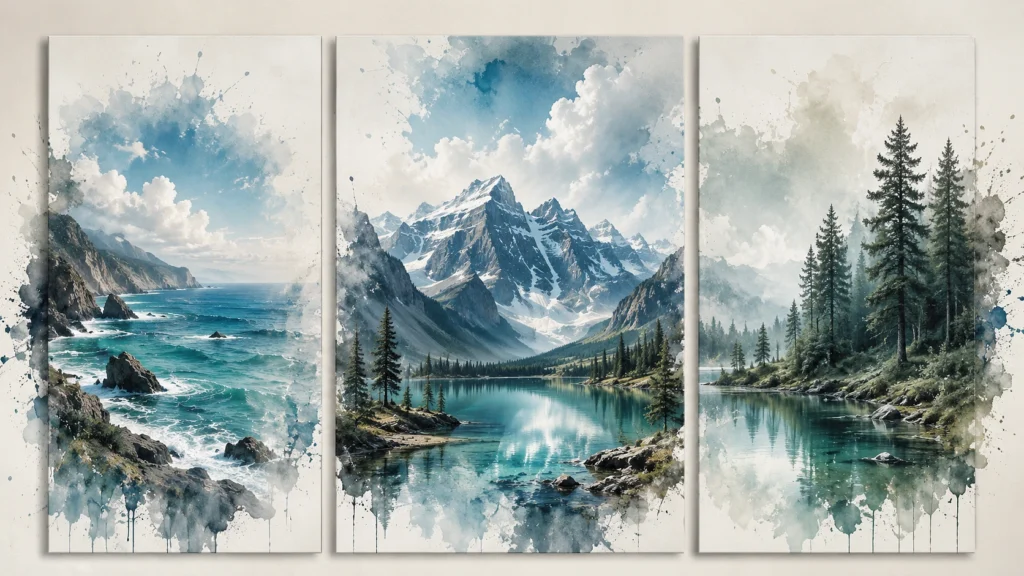
South rooms have the opposite situation. The light is already warm and generous, so people rarely complain. But add one more warm painting and the room starts feeling stuffy, mainly in summer months.
Here cooler landscapes give relief. Coastal scenes with open water and big sky. Alpine mountains with snow and blue shadows. Even a grey overcast seascape works nicely in a south room because the warm sunlight stops it from looking gloomy.
Interior guides commonly suggest blue and green undertones as the natural balance for south-facing rooms, since they cut the warmth without reducing the brightness. One good painting can do this whole job. No need to repaint any wall.
3. Small or Dim Rooms Need a Low Horizon Line
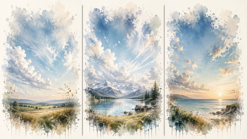
This point is about composition, not color. As a painter I can tell you the horizon line changes everything in a landscape.
Horizon line means the line where land meets sky. If the artist keeps it low on the canvas, the painting becomes mostly sky. If the line is high, the painting becomes mostly land. For a small or dark room, always pick the low horizon painting. A canvas which is around eighty percent sky works almost like an extra window. The eye travels deep inside the painting and the wall stops feeling like a wall.
When buying, check three things. The horizon should sit in the bottom third of the canvas. The far away elements should look pale and hazy, painters call this atmospheric perspective. And the foreground should be clean, without heavy trees or rocks blocking the view inside.
Avoid dense forest scenes and narrow canyon scenes in small rooms. They press the space inward. You want distance, and sky gives the most distance.
4. Big Walls and Open Halls Need Proper Scale
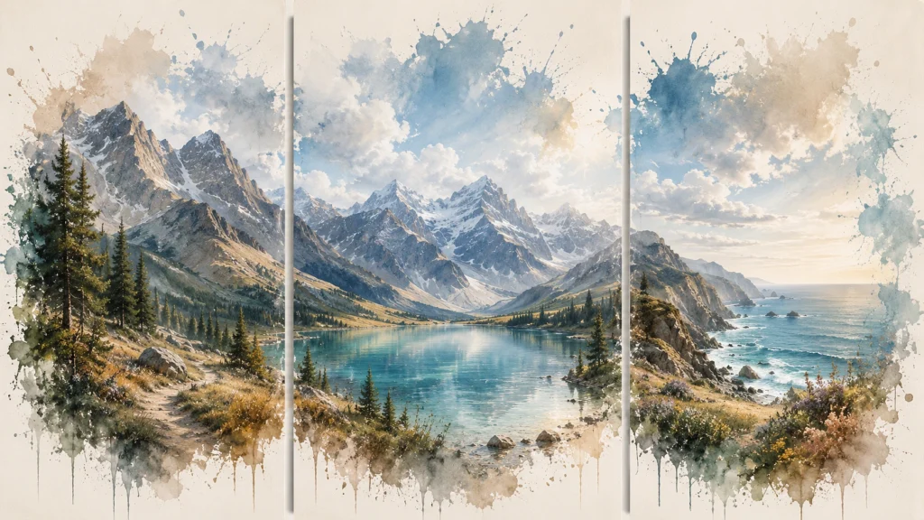
Large walls eat small paintings. A normal 24 by 36 inch canvas on a double-height wall looks like a stamp, does not matter how good the painting is.
Two simple rules help here. The two-thirds rule says the artwork should cover roughly two-thirds of the width of the furniture below it. So above a 90 inch sofa, aim for around 60 inches of painting or grouped panels. For height, galleries follow the 57-inch rule, keeping the center of the artwork at 57 inches from the floor, which is average eye level.
For landscape subjects, I always suggest a triptych, one scene divided into three panels. The gaps between panels add extra width without extra cost, and panoramic subjects like mountain ranges and coastlines naturally suit this format.
One more thing for open halls. You will see this painting from far, sometimes 15 to 20 feet away. Fine detail work disappears at that distance. Choose paintings with bold color blocks and strong shapes instead of tiny detailed brushwork which only looks good from close.
5. Rooms with Wooden Furniture, Match the Undertone
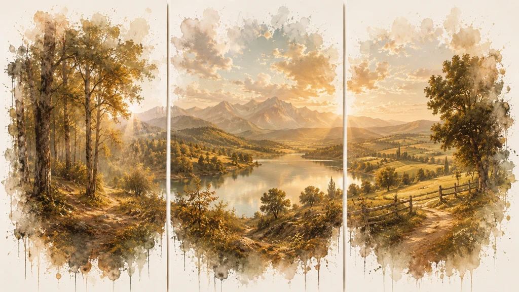
Oak flooring, walnut furniture, teak shelves. In many homes, wood covers more area than any paint color. And wood has undertones just like paint. Most common woods lean toward yellow-orange or red.
A landscape hanging above warm wood should carry that same undertone family somewhere in its palette, even if its main color is totally different. A green forest scene sits well above walnut furniture when the greens are olive and moss type, means yellow-based greens. The same wall will fight with a blue-based emerald green forest. You will feel the clash even before you can explain it.
My quick trick before buying, look at the shadows in the painting. Warm paintings have brownish shadows. Cool paintings have blue-grey shadows. Match the shadow temperature with your wood tone and the room settles down nicely.